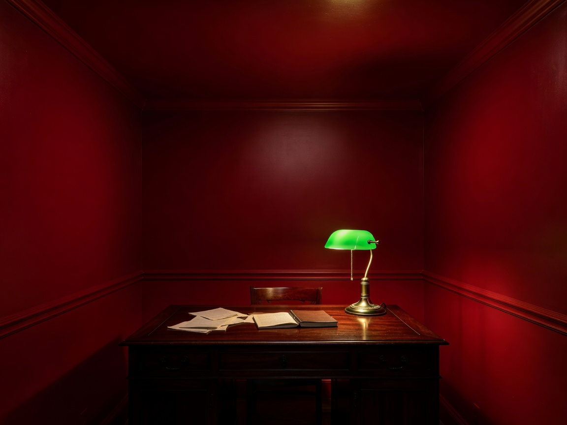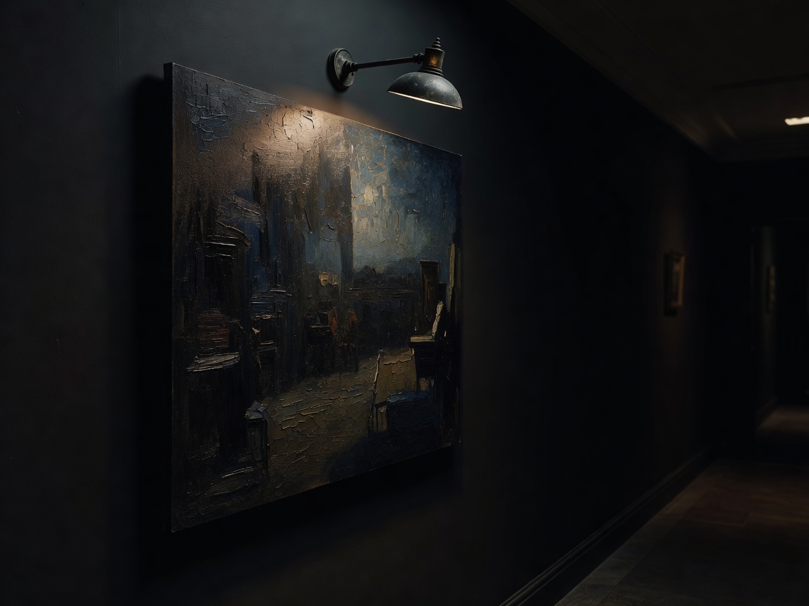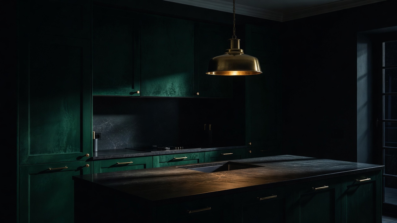
The most common regret we hear is "the colour looked different in the shop". It did, because paint has no fixed colour. It reflects whatever light reaches it, and that light changes from cool morning sky to warm evening lamp. Choose colour and light as a pair, and you stop gambling.
Undertones decide everything
Every colour leans somewhere. A grey can lean green, violet or brown; a white can lean yellow, pink or grey. Under warm evening bulbs, warm undertones deepen and glow, while cool undertones turn murky. This is why so many grey living rooms from the 2010s look tired at night: a cool grey under a 2700K bulb reads as dull putty.
To see the undertone, hold the swatch against pure white printer paper, then against something known to be warm, such as a wooden table. Then paint a large sample, at least A3, on two walls and look at it at 9 pm with your actual lamps on. Brands such as Farrow & Ball, Little Greene and Lick sell sample pots; peel-and-stick samples are a useful renter-friendly alternative.
Colour drenching
Colour drenching means painting walls, skirting boards, door frames and sometimes the ceiling in one colour, or in close tones of it. It removes the visual lines that tell the eye where the room ends. In a small, dark room this is the single most dramatic move available for the price of a few tins. Use a slightly glossier finish on woodwork for durability; the sheen difference gives just enough definition.
If drenching feels too committed, try a "fifth wall": paint only the ceiling a soft, warm colour such as a dusty pink or ochre. It bounces tinted light back down and changes the mood of everything beneath it.
Light in layers
Designers talk about three layers. Ambient light gives general illumination; in a moody room it should be soft and indirect, from wall lights, uplighters or a shaded pendant on a dimmer. Task light is focused where you read, cook or work: a desk lamp, an under-cabinet strip, a reading lamp by the chair. Accent light picks out something worth seeing, such as a picture light over art or a small spot on a plant.
The rule we give every reader: at least three light sources at three different heights in any room used at night. Floor level, table level and above eye level. Light from one height flattens a room; light from three gives it depth and shadow, which is where atmosphere lives.
Kelvin and CRI, in plain English
Colour temperature is measured in Kelvin. Around 2200–2700K is warm, like candle or traditional incandescent light; 3000K is soft white; 4000K and above is cool and closer to office light. For living rooms and bedrooms after dark, stay between 2200K and 2700K. Kitchens and bathrooms can use 3000K for tasks, ideally on a separate circuit from warmer mood lighting.
CRI, the Colour Rendering Index, measures how faithfully a bulb shows colours on a scale to 100. Aim for CRI 90 or higher. A cheap bulb with CRI 80 can make an expensive paint look grey and skin look sallow. The price difference is usually a pound or two per bulb, and it is the best money you will spend on a room.
Dimmers and smart bulbs
Owners should consider dimmer switches on every main circuit; make sure your bulbs are labelled dimmable and use a qualified electrician. Renters can get the same effect with plug-in dimmers or smart bulbs that dim from a phone, which leave no trace when you move out. Avoid colour-changing modes beyond warm white: saturated coloured light rarely flatters a home.
A night-tested sequence
Pick your lamps first, then your paint. Fit 2700K, CRI 90+ bulbs. Paint large samples. Judge them at night with those lamps on, and again on a grey morning. Only then buy the tins. It takes a week longer and saves repainting.
See how these ideas translate to tight footprints in Small Rooms, Big Moves, or check our bulb and lamp questions in Before a Makeover.